
The 5-Point "Human Audit" Your Website Needs Right Now

Rich Keller • January 29, 2026

You don't need a total redesign to look more human. You just need to strip away the "corporate beige" that has accumulated over the years.
Here is the exact 5-point audit I run for new clients. Open your website in a new tab and check these right now.
- The "Stock Photo" Check
Look at your Homepage. Do you see a photo of a generic team high-fiving in a glass conference room?
The Fix: Delete it. Replace it with a photo of your actual office, even if it’s messy. In 2026, grit equals trust. - The "I" vs. "We" Ratio
Read your "About" page. How many times do you use the passive voice ("It was decided that...")?
The Fix: Change it to active voice. "I decided to..." or "Our team chose to..." - The Biography Test
Does your blog author say "Admin" or "Rich Keller"?
The Fix: Every post needs a real human name and a link to a LinkedIn profile. Google’s E-E-A-T algorithm demands to know who is speaking. - The "Contact" Friction
Do you have a generic contact form with 12 fields?
The Fix: Add a direct email address (mailto link) or a phone number. Prove there is a human on the other end, not a database. - The Story Factor
Do you have a "History" or "Our Story" section?
The Fix: If not, add one. AI cannot hallucinate a genuine founding story (at least, not a convincing one). Your history is your unique fingerprint.
Rich’s Corner:
I once had a client who was terrified to put his photo on his site because he didn't "look corporate enough." We tested it. We replaced the stock model with a photo of him in his plaid work shirt. Conversions went up 40%.
People don't buy from corporations; they buy from people they like.


Regular builders don’t want a lecture on carbonation; they just want a Coke. Here's why vibe coding AI tools get stuck in the weeds and how to simplify them.

A friendly, tongue-in-cheek look at how small business owners can use AI wisely, without making customers (or Google) wonder if a human is actually running the show.

A friendly guide for busy business owners on what GEO is, how it differs from SEO, and what practical steps to take now.
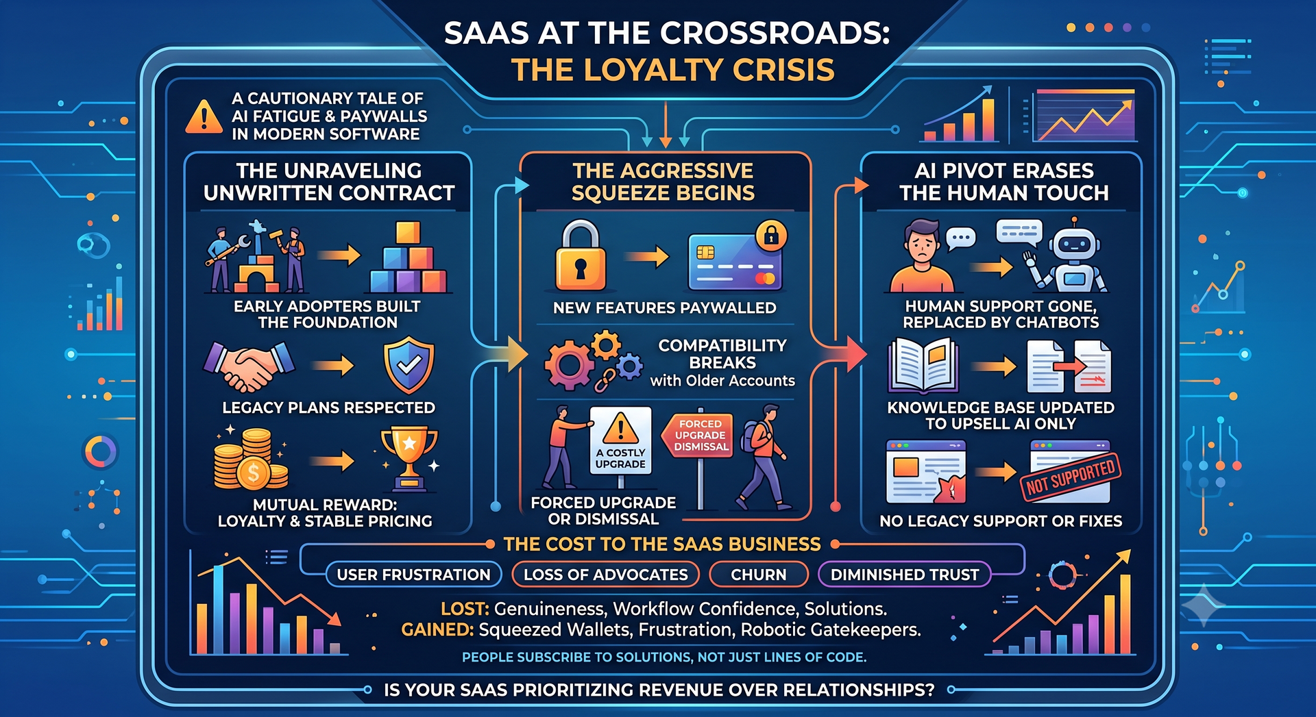
Why AI and Paywalls Are Killing User Loyalty

The 2026 Website Paradox: Why Small Businesses Need a Digital Home More Than Ever in the AI Era

10 Things Digital Marketers Say (And What They Actually Mean)
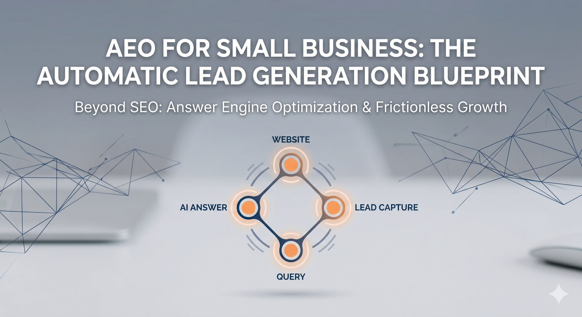
What is AEO? The Evolution from SEO to Answer Engines
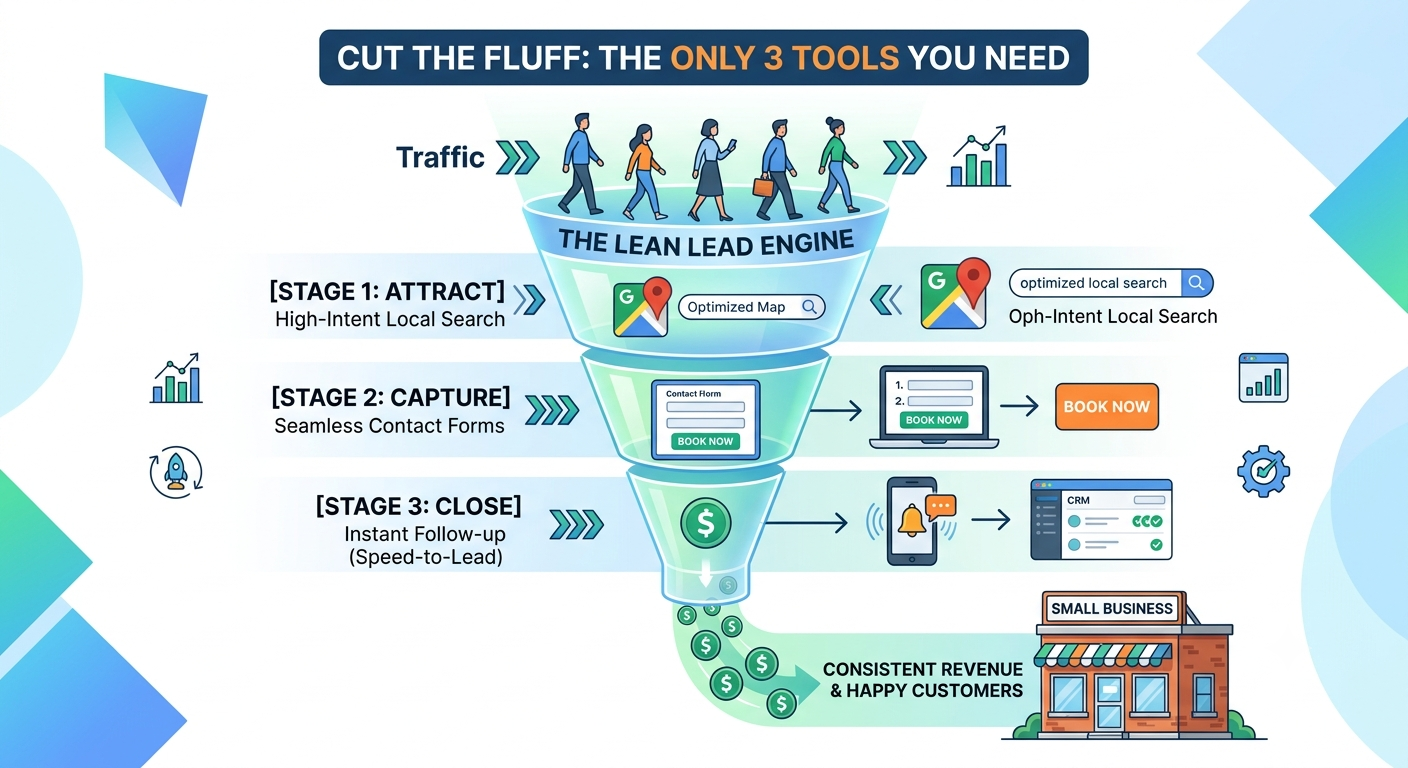
Stop Buying "Features" and Start Buying Customers: The Lean Tech Stack Rules
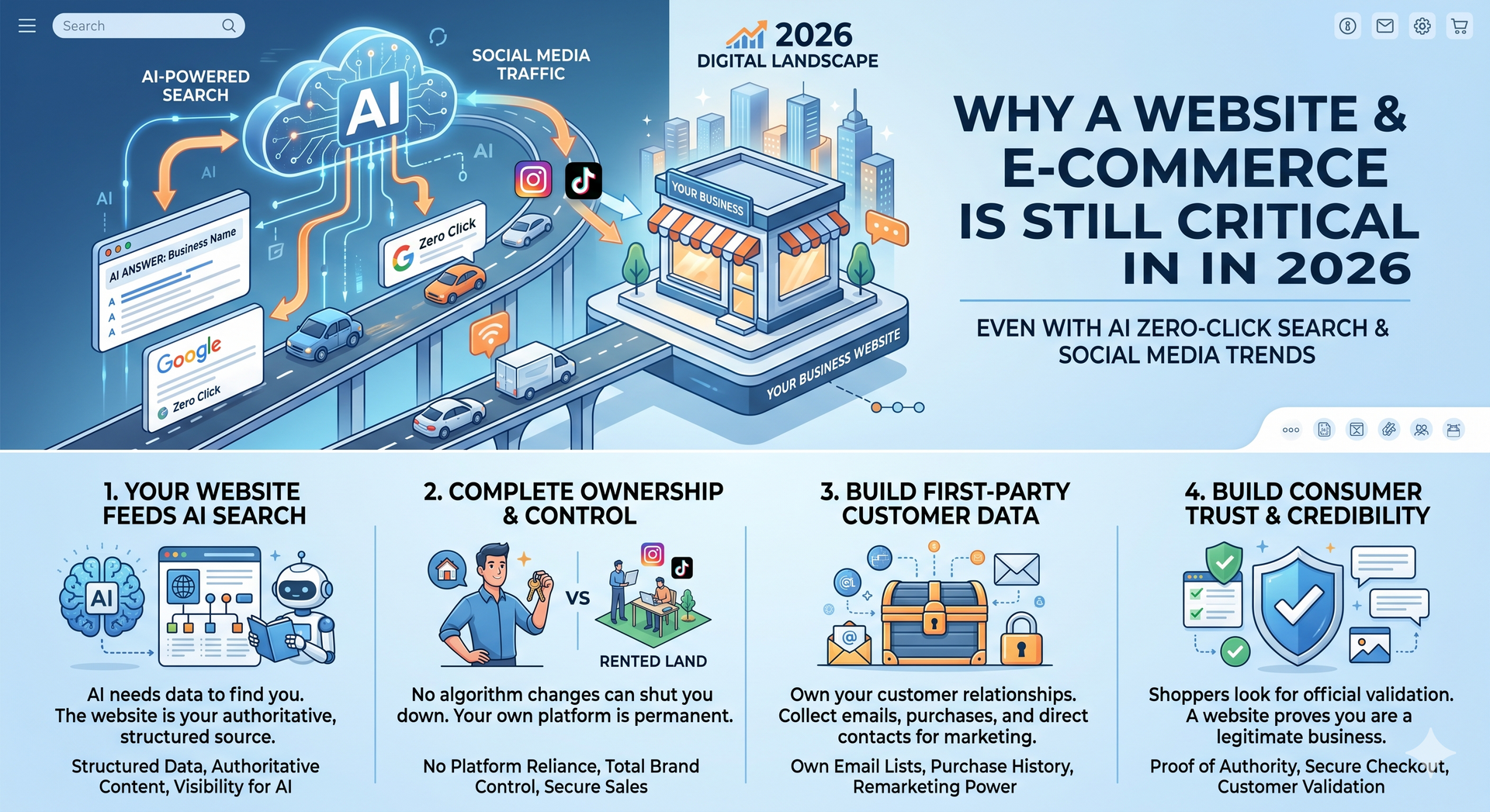
Why a Website (and E-Commerce) is Still Non-Negotiable in 2026 (Even in the Age of AI Search)