
Design Series 02 | Less is More Formatting content that is easily read

Less is More - More is More

Less is More
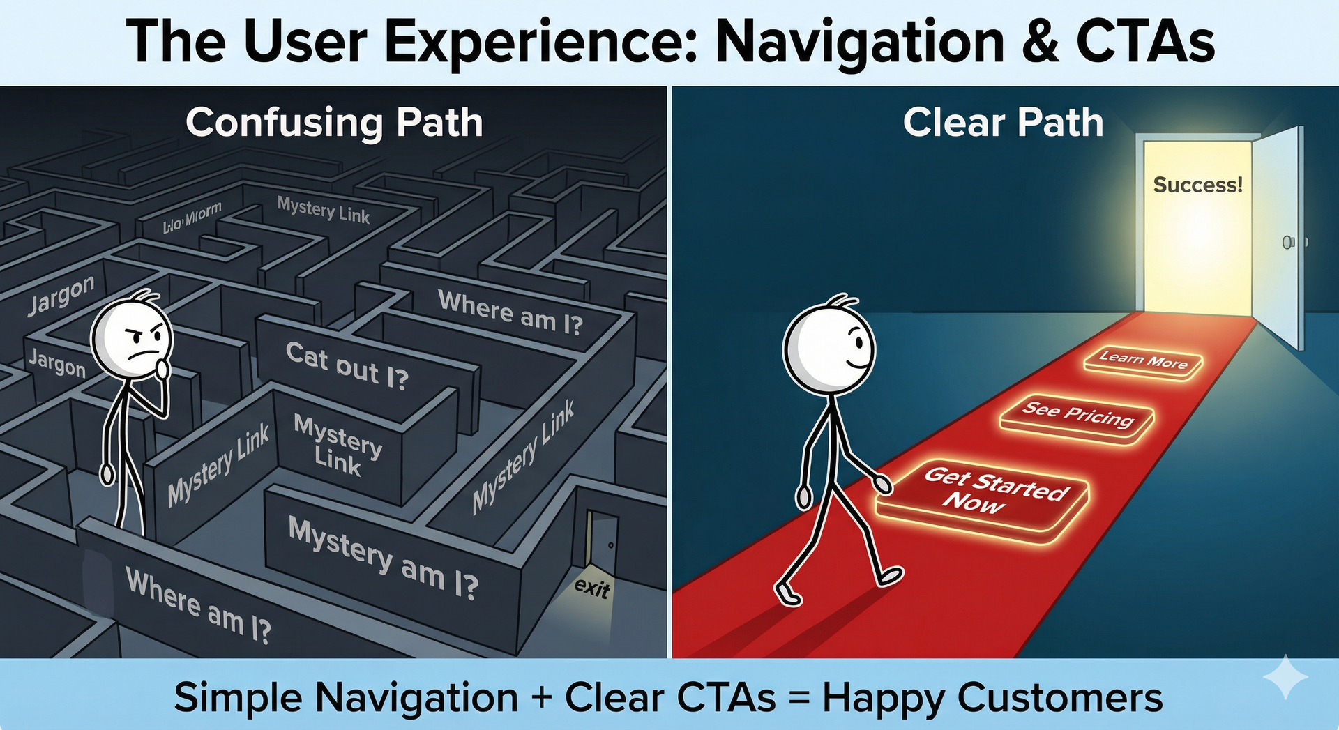
White space
This tip is generally for formatting web pages to display content that is easily read at a glance.
You may have heard about white space and negative space before, but weren't sure how to implement them with your content.
Here are 2 examples using the same text.
1. This is the text you need to read.
2. This Is The Text You Need to Read
Isn't that just a bigger font? Yes and No. Everyone has relatively huge screens with high resolutions, so don't fear to add space around the critical headlines and information that you really want to showcase. Adjusting accordingly for desktop and mobile.
A few great examples of minimalist design using whitespace are:
https://store.google.com/ca/product/google_nest_mini
and
https://www.apple.com/ca/ipad-air/
Scroll down and see how there is actually very little text content, but each piece is maximized and spread out for full visual impact.
You could easily fit either of these examples content onto a single page all "above the fold" which designers used to like to do, but scrolling isn't a bad thing anymore, people love scrolling on their phones, it's almost therapeutic. Scrolling can actually help sell the product because as you scroll it reveals a story, not just content, leading them to convert.


Cost-Effective Turnkey Solutions at Just $149/month.
Transform your online presence with Rich Keller.
Starting at $149/month, you receive:
- Professional Website
- AI Tools for Writing
- SEO Optimization
- Digital Marketing Services
- Unlimited edits.